

Web Excursions 2021-04-29

🌟 [Post of The Day] Beyond Calibri: Finding Microsoft's next default font - Microsoft 365 Blog
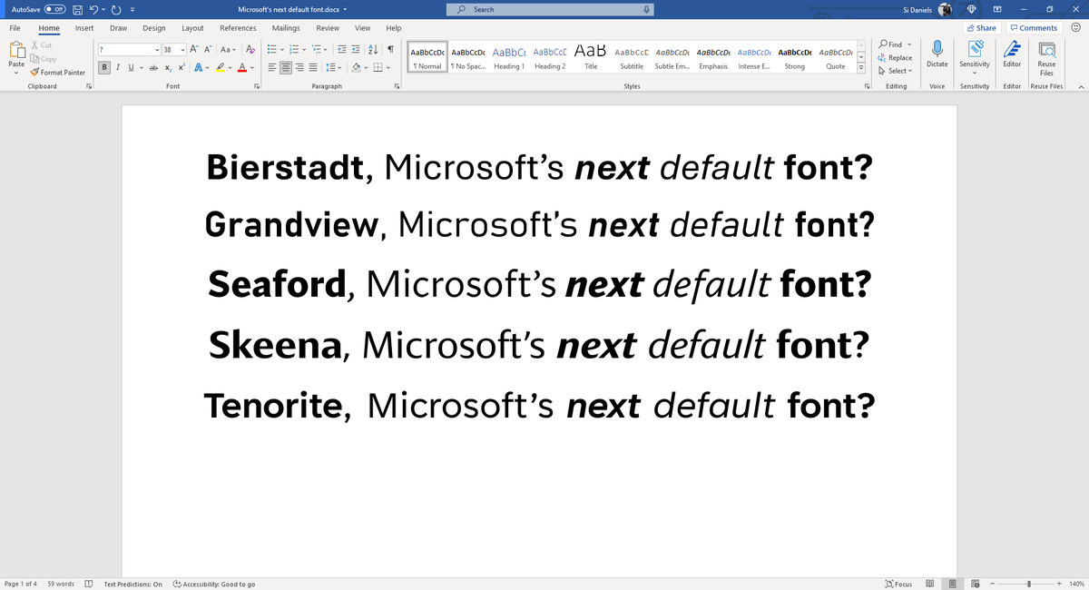
TENORITE
by Erin McLaughlin and Wei Huang
the overall look of a traditional workhorse sans serif
but with a warmer, more friendly style
comfortable to read at small sizes: large dots, accents, and punctuation
a generally open feeling: crisp-looking shapes and wide characters
Desinger’s words
love the circular forms and sturdiness of Adrian Frutiger’s Avenir
more generous character spacing is helpful for reading and writing long paras of text in Word
The display styles are much narrower and inspired by Trade Gothic
great for use in PowerPoint presentations; and creating column headings in Excel spreadsheets
Punctuation is intentionally made large and circular
BIERSTADT
by Steve Matteson
a precise, contemporary sans serif typeface inspired by mid-20th-century Swiss typography
versatile, simple and rational; “clear-cut with stroke endings that emphasize order and restraint.”
Designer's words
Microsoft had requested a new typeface in the “grotesque sans serif” genre – Helvetica-like
a grotesque typeface’s voice needs a bit of a human touch to feel more approachable and less institutional
my approach was to design a sans serif which would contrast with Arial by being far more mechanical and rationalized
The terminal endings are precisely sheared at 90 degrees—a modern note contrasting the softer, angled endings in Arial—and a lack of somewhat fussy curves found in Arial’s ‘a’, ‘f’, ‘y’ and ‘r’.
named for one of Colorado’s 14,000 ft peaks; since I’m based in Boulder, my Alps are the Rockies
SKEENA
by John Hudson and Paul Hanslow
a “humanist” sans serif based on the shapes of traditional serif text typefaces.
modulated strokes,
noticeable contrast between thick and thin
a distinctive slice applied to the ends of many of the strokes
Designer's words
We wanted to create a humanist sans serif with generous proportions and a higher than usual stroke contrast
diagonally sheared terminals; the curving of entry and exit strokes in letters like ‘n’ and ‘a.’
Microsoft wanted us to design for both text and display fonts; the display variant “have a more dramatic impact.”
respectfully nods towards type-forms of the 20th Century while adding a touch of unfamiliarity; gently subverts expectations without polarizing the wonderful humanist san serifs that came before it.
SEAFORD
by Tobias Frere-Jones, Nina Stössinger, and Fred Shallcrass
rooted in the design of old-style serif text typefaces and evokes their comfortable familiarity
gently organic and asymmetric - emphasizing the differences between letters, thus creating more recognizable word shapes.
Desiger's words
MS' initial requirements: comfortable, warm, inviting, animated
a preference for differentiation of shapes over repetition and symmetry
earliest drafts focused on the lowercase branches, bowls, and terminals - most of the running text is set in lowercase
when it comes to italics, it turns out there are parallels between chair ergonomics and typography: rather than inflating it and making it softer, trust the rigid moments that are good for your back.
GRANDVIEW
by Aaron Bell
derived from classic German road and railway signage; designed to be legible at a distance and under poor conditions.
Thoughts:
Express consideration for optical sizes
Missing a mono font
Why no serif?
Similar fonts
Skeena: Gill Sans
Grandview: DIN?
Designer's word
asked to create a font that retained the spirit and personality of the German Industrial Standard (DIN) and was more readable for body text
need to encourage the eye horizontally across longer lines of text
but DIN was intended for high legibility in short runs of text in medium to narrow spaces
decided to keep the x-height large
Ultimately, I found increasing the width of the lowercase by 40 units (four to five percent) was perfect. width of the uppercase was also increased by about 20 units (roughly two percent)
ClearType font collection - Typography | Microsoft Docs
The ClearType Font Collection is the result of a successful collaboration of both designers and engineers working together with respect, flexibility, and curiosity. ClearType fonts were conceived from the outset as a marriage of technology and the best in design expertise! This improves the appearance of text on certain types of monitors through the use of subpixel rendering technology.
Constantia: a modulated wedge-serif typeface designed by John Hudson primarily for continuous text in both electronic and paper publishing.
Corbel: designed to give an uncluttered and clean appearance on screen. The letter forms are open with soft, flowing curves. It is legible, clear and functional at small sizes. At larger sizes the detailing and style of the shapes is more apparent resulting in a modern sans serif type with a wide range of possible uses.
Calibri: a modern sans serif family with subtle roundings on stems and corners. It features real italics, small caps, and multiple numeral sets. Its proportions allow high impact in tightly set lines of big and small text alike. Calibri’s many curves and the new rasteriser team up in bigger sizes to reveal a warm and soft character.
Cambria: has been designed for on-screen reading and to look good when printed at small sizes. It has very even spacing and proportions. Diagonal and vertical hairlines and serifs are relatively strong, while horizontal serifs are small and intend to emphasize stroke endings rather than stand out themselves. This principle is most noticeable in the italics where the lowercase characters are subdued in style to be at their best as elements of word-images. When Cambria is used for captions at sizes over 20 point, the inter-character spacing should be slightly reduced for best results. The design isn't just intended for business documents: The regular weight has been extended with a large set of math and science symbols. The Greek and Cyrillic has been designed under close supervision of an international team of experts, who aimed to set a historical new standard in multi-script type design.
Candara: a casual humanist sans with verticals showing a graceful entasis on stems, high-branching arcades in the lowercase, large apertures in all open forms, and unique ogee curves on diagonals. The resultant texture is lively but not intrusive, and makes for a friendly and readable text.
Consolas: aimed for use in programming environments and other circumstances where a monospaced font is specified. All characters have the same width, like old typewriters, making it a good choice for personal and business correspondance. The improved Windows font display allowed a design with proportions closer to normal text than traditional monospaced fonts like Courier. This allows for more comfortably reading of extended text on screen. OpenType features include hanging or lining numerals; slashed, dotted and normal zeros; and alternative shapes for a number of lowercase letters. The look of text can be tuned to personal taste by varying the number of bars and waves.
Microsoft is changing the default Office font and wants your help to pick a new one
Microsoft is changing its default Office font next year and wants everyone to help pick the new default. While there are more than 700 font options in Word, Microsoft has commissioned five new custom fonts for Office, in a move away from the Calibri font that has been the default in Microsoft Office for nearly 15 years.
The five new sans-serif fonts feature a variety of styles, including traditional, modern, and even one inspired by German road and railway signs. Microsoft is starting to gather feedback on these five new fonts today, and it plans to set one as the new Office default font in 2022.
Is there a DIN font free alternative?
There is now an OFL-licensed, completely free/libre version of DIN called Alte DIN.
This is legal because DIN 1451 is a product of the German government, and so is in the public domain -- only the individual interpretations of it by various font foundries are protected and copyrighted. Thankfully Peter Weigel traced it for us!